
A nonprofit’s guide to website navigation (and how to prepare your team for the discussion)
Most nonprofit websites have navigation built around how the organization thinks about itself, not how visitors actually use it. Here's…

Let me guess—you’re knee-deep in launching your nonprofit, building relationships with potential supporters, drafting mission statements, and someone just mentioned you need to make your website “accessible.”
Great. One more thing to Google at midnight, right?
If you’ve stumbled across those “one-click accessibility solutions” that promise to magically make your site inclusive and compliant, I get why they sound tempting. With everything else on your plate, who wouldn’t want an easy fix?
But here’s the thing—I’ve seen too many organizations waste precious time and resources on solutions that don’t actually solve the underlying accessibility issue. Let’s talk about what really works (and what doesn’t) when it comes to making your nonprofit’s website truly accessible.
Accessibility plugins (like AccessiBe, UserWay, or EqualWeb) are widgets you can add to your WordPress site that claim to make it more inclusive for people living with disabilities. They typically offer features like screen reader compatibility, color contrast adjustments, and text size controls.
They market themselves as quick solutions for complying with ADA guidelines—perfect for busy nonprofit founders who don’t have time to become accessibility experts, right? (If you’re not sure where to start, we have a recommended tech stack that’s tailored for nonprofits.)
They don’t fix the underlying issues. These plugins do not fix underlying code issues. For example, if your buttons are not labeled correctly, your forms are not structured properly, your colors don’t have high enough contrast, or your iframe YouTube videos don’t have titles, an accessibility plugin (also known as an overlay) will not resolve these issues for people who use screen readers.
They slow down your site. Many of these tools add heavy third-party JavaScript that impacts your page loading speed.
They can actually create more barriers. Ironically, many accessibility overlays interfere with the very assistive technologies they claim to support, creating a frustrating experience for visitors living with disabilities. See this letter of accessibility advocates opposing overlays/plugins.
They create a false sense of security. Having a widget doesn’t mean your site is truly accessible or legally compliant—which could put your organization at risk down the road.
They often come with outrageous recurring costs. Many plugins start with a free trial but then require monthly subscriptions—another expense eating into your limited nonprofit budget.
True accessibility isn’t a plugin—it’s building your website with everyone in mind from the foundation up.
The good news? Creating an accessible website doesn’t have to mean hiring an expensive developer or becoming a coding expert. It just means making thoughtful choices from the beginning.
Here’s what we teach mission-driven founders in our approach:
Add labels to icons and buttons. Many nonprofit sites use social media icons or buttons with symbols but no text. Screen readers can’t interpret these without help. That’s where “ARIA-labels” (Accessible Rich Internet Applications) come in—they’re like invisible name tags for visual elements. For example, a Facebook icon needs an ARIA-label saying “Visit our Facebook page” so screen reader users know what it does. Most website builders let you add these labels in the settings for buttons and links.
Use a clear site structure. Think of your site like a well-organized house—every room should have a clear purpose and be easy to navigate. In website terms, this means using proper headings (H1, H2, H3) and organizing content logically.
Make everything keyboard-friendly. Many people living with disabilities navigate websites using only their keyboard. Make sure all your interactive elements (like buttons and forms) work without a mouse.
Add descriptive alt text to images. This allows screen readers to describe your images to those who can’t see them. Think about describing the purpose of the image rather than just what it shows. Read this article on how to implement descriptive alt text.
Create accessible forms. If you’re collecting donations or contact information, ensure every form field has a proper label (not just placeholder text that disappears). When someone encounters an error, provide clear, specific error messages that explain exactly what needs fixing.
Ensure strong color contrast. Your text should stand out clearly against backgrounds—this helps people with visual impairments and honestly makes your site more readable for everyone. Aim for at least a 4.5:1 contrast ratio for body text to meet accessibility standards. Free tools like WebAIM’s Contrast Checker or WhoCanUse can help you test your color pairings and ensure your site is readable for all users.
Keep navigation simple and consistent. Complex, unpredictable menus are barriers for everyone, especially those using assistive technology.
Include a skip-to-content link. This simple addition helps keyboard users bypass your menu and access important content. Most page builders have this added automatically. A manual test with WAVE can help you see if your site has one or not.
Ensure your PDFs are accessible. Remember that shared documents, such as annual reports, grant applications, and event flyers, must be accessible. This includes adding clear headings, alt text for images, readable fonts, and tagged content for screen reader navigation. Use the built-in accessibility checkers in word processors (like Microsoft Word or Google Docs) before converting your document to PDF. During export, select options like “Enable accessibility and reflow with tagged Adobe PDF” to maintain the accessible structure.
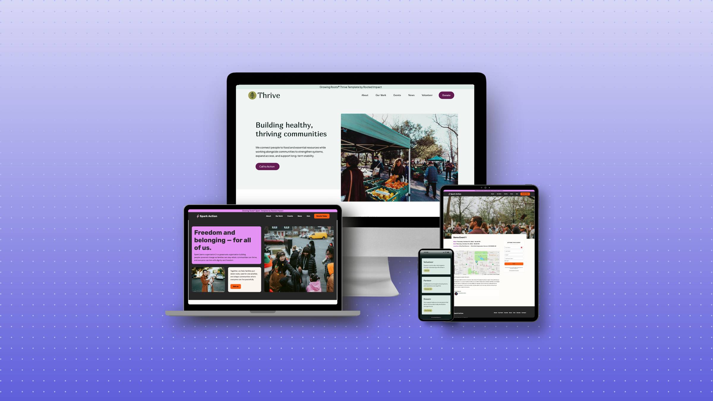
Most of these steps can be implemented using WordPress and Breakdance (our recommended tools) without special plugins or coding knowledge. Small changes make a big difference—and they align perfectly with your values of inclusion and community service.
You can absolutely address these concerns without relying on a plugin. Instead, create a simple Accessibility Statement page that:
This is actually a great opportunity to demonstrate your organizational values. Your thoughtful approach to accessibility can become a strength in your applications.
I also recommend doing some basic testing yourself. Try navigating your site using only your keyboard or turn on the built-in screen reader on your phone and listen to how it reads your homepage. These quick checks can reveal obvious issues and help you understand how different visitors experience your site.
If possible, consider asking someone who uses assistive technology to give you feedback on your site’s usability. Their real-world experience will be invaluable—and it’s another way to build meaningful connections within your community.
As someone building a nonprofit or community initiative, you’re already committed to making a difference. Website accessibility simply extends that commitment, ensuring everyone can access your important work.
The goal isn’t perfection; it’s progress. Start small and implement what you can with the tools you currently have. Every thoughtful improvement you make opens your digital door wider to someone who might otherwise be left out.
Remember: the communities you serve likely include people living with disabilities. When your website is accessible, you’re not just checking a box—you’re living your values and reaching more of the people you’re dedicated to supporting.
Do you feel unsure about your homepage, are overwhelmed by design tools, and frustrated that your site doesn’t reflect the depth of your mission?
You’ll walk away with a clear and powerful homepage layout that tells your story, builds trust with funders and supporters, and reflects the heart of your movement — without needing to hire a designer or master tech tools.
Register Now → Digital Roots Workshop
After nearly a decade supporting nonprofits and campaigns, I’ve seen firsthand how the right website can transform an organization’s impact. You don’t need technical expertise or a huge budget—you just need the right tools and a strategic approach. This stack has helped mission-driven organizations pass progressive policies, secure critical funding, and build movements that matter. Your mission deserves nothing less. – Caitlin Rice

© 2026 Rooted Impact. All rights reserved.