
A nonprofit’s guide to website navigation (and how to prepare your team for the discussion)
Most nonprofit websites have navigation built around how the organization thinks about itself, not how visitors actually use it. Here's…

If you’ve ever found yourself digging through old folders to find “that flyer from last year” or copying and pasting from your website into your Instagram caption and hoping for the best… this is for you.
Keeping your branding consistent across platforms doesn’t require a full-time designer or a six-figure budget.
It just takes a little planning and a clear understanding of what goes where.
Let’s break it down.
Nonprofits and unions often worry too much about “looking polished” and not enough about being clear and trustworthy.
You don’t need your Instagram, emails, and printed flyers to look identical, but they should feel like they belong to the same organization. Why? Because when people recognize you at a glance, they’re more likely to engage, donate, or share your message.
Consistency builds trust. And trust builds momentum.
You aren’t alone if you feel like content creation in 2025 is a hamster wheel that just keeps spinning faster. With all the options across all the different platforms, it can feel hard to keep up and know how to adapt. That’s why we are breaking it all down with both the design and messaging must-haves.
Here’s how to think about brand elements across your digital and print touchpoints. To make it more tangible, I added content examples from a fictional labor union, Midwest Care Workers United, organizing home health aides across Ohio and Michigan.
Main goal: Explain your work, build credibility, drive action.
Design must-haves:
Messaging must-haves:
Example:
💻 Homepage headline:
“We fight for dignity, fair wages, and a voice on the job for every care worker.”
📸 Hero image:
A powerful photo of a caregiver with a client in their home—not stock imagery, but a real member of the union. (Whenever possible.)
Main goal: Build relationships and expand visibility.
Design must-haves:
Messaging must-haves:
Example:
📱 Instagram Post:
Image: A behind-the-scenes shot of union members prepping signs for an upcoming rally
Caption: “Care work is real work. And we’re showing up to remind lawmakers of that truth. Join us this Saturday at the Capitol.”
Main goal: Nurture your audience and deepen engagement.
Design must-haves:
Messaging must-haves:
Example:
✉️ Monthly email newsletter
Subject line: “One win, two rallies, and a story that’ll move you”
Feature story: A short Q&A with a caregiver who won back pay thanks to union support
CTA button: “Read Their Story”
Main goal: Inform or inspire quick offline engagement.
Design must-haves:
Messaging must-haves:
Example:
📄 Flyer for an upcoming training
Headline: Know Your Rights as a Home Health Aide
Image: Real caregiver looking confident in their uniform
QR Code: Scannable link to register for a free workshop
Footer: Midwest Care Workers United | [your phone number] | [your website]
Take 15 minutes this week to gather:
Drop it all into an easily accessible Google Doc or Canva template (We included one you can use in our free Nonprofit Website Design Starter Kit!).
That way, next time someone needs to design a flyer or post an event update, you’re ready.
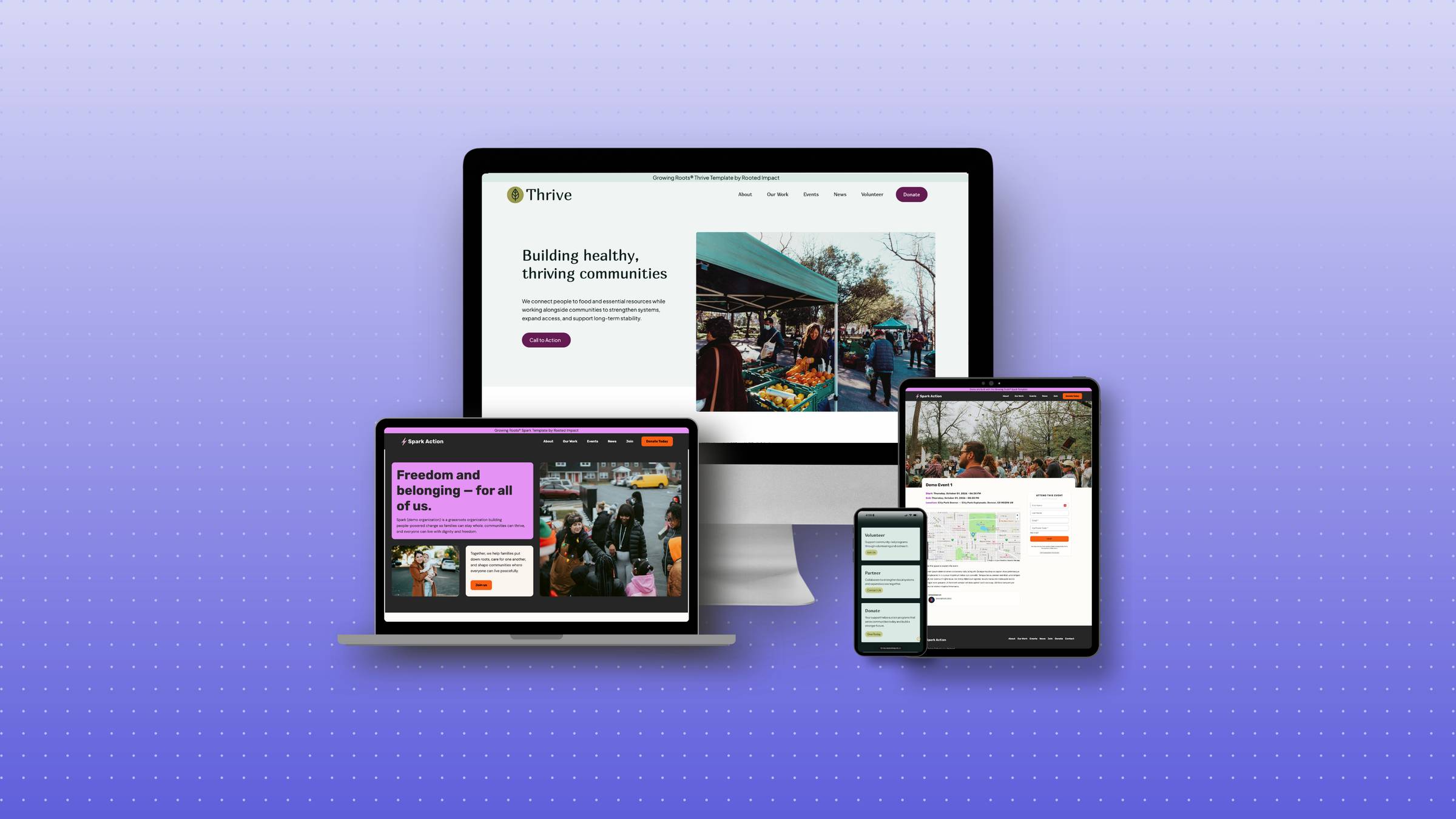
Download our free Nonprofit Website Design Starter Kit for small but mighty teams who want to look more cohesive online, without spending a fortune.
Inside, you’ll get:
Because your mission deserves to be seen, felt, and remembered.


© 2026 Rooted Impact. All rights reserved.